Parse.ly Analytics - UI Highlights

A few user interface highlights from my time spent with Parse.ly Analytics, going from zero to a mature product in ten years. The result is team effort, and you can see the full crew in the Parse.ly web page's about section. The frontend team (the one directly responsible for everything users interact with) was always small: somewhere between just me and a team of five. My personal role, from the get-go was that of lead user interface programmer.

Quick Intro

Top posts (click to zoom)

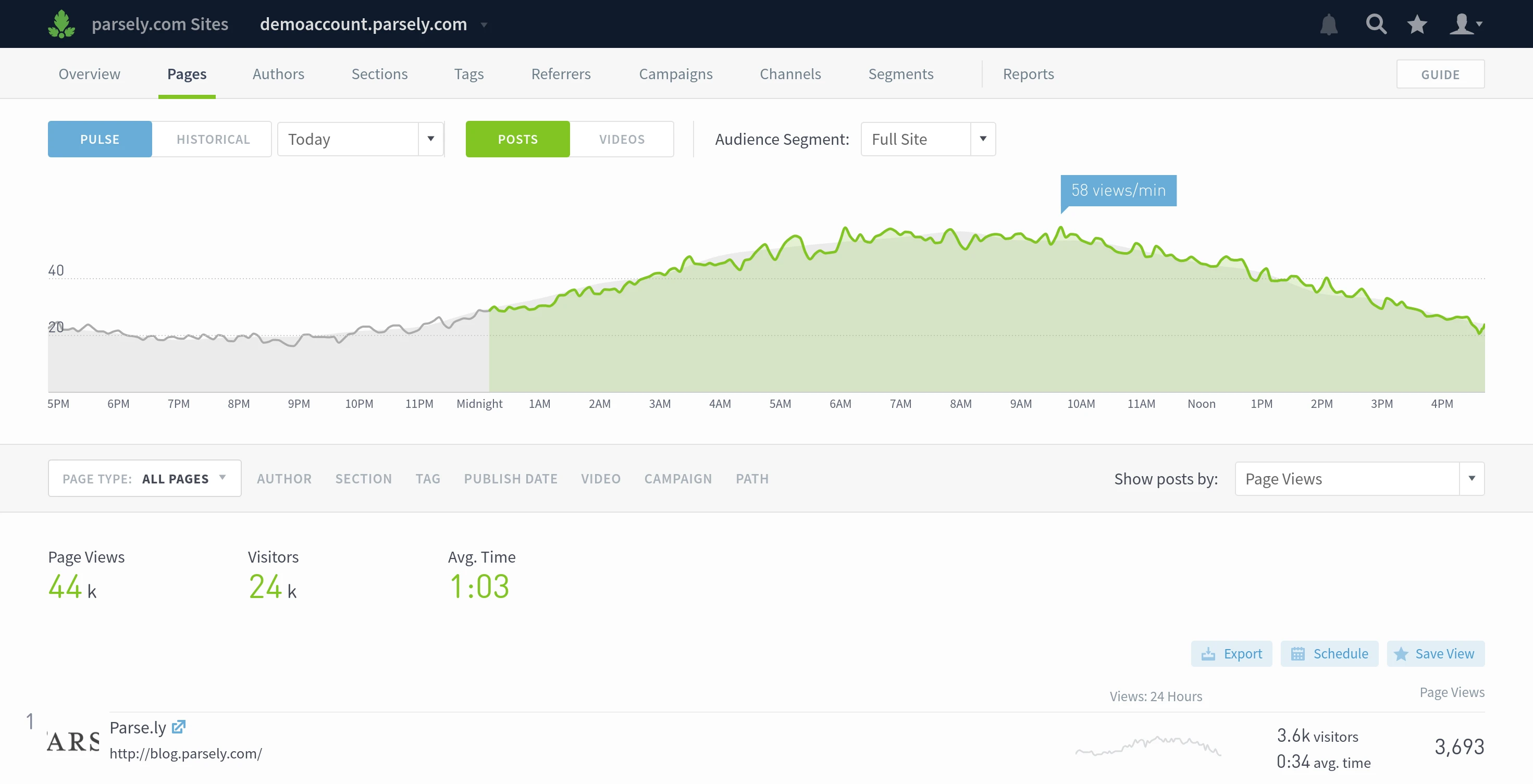
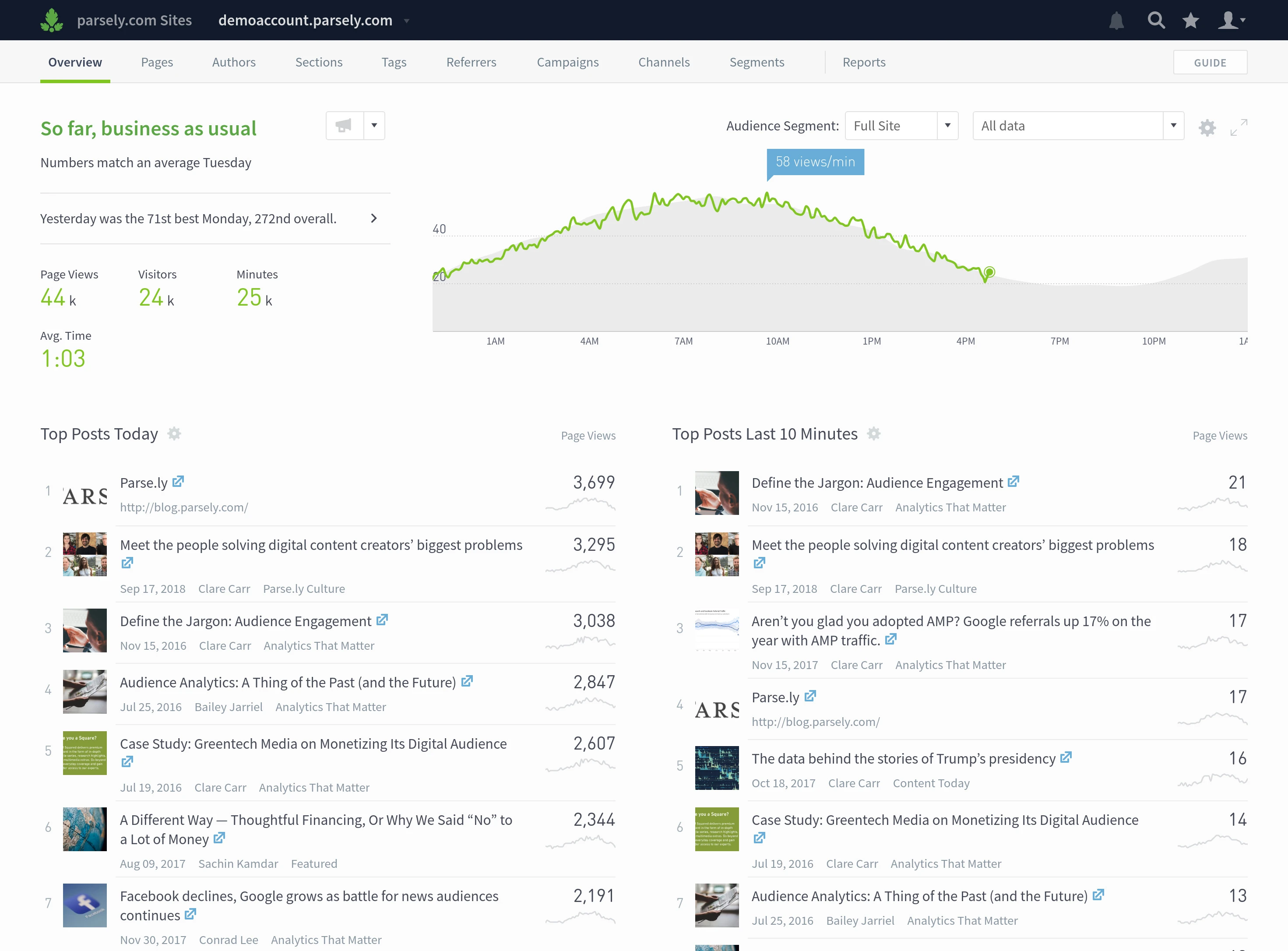
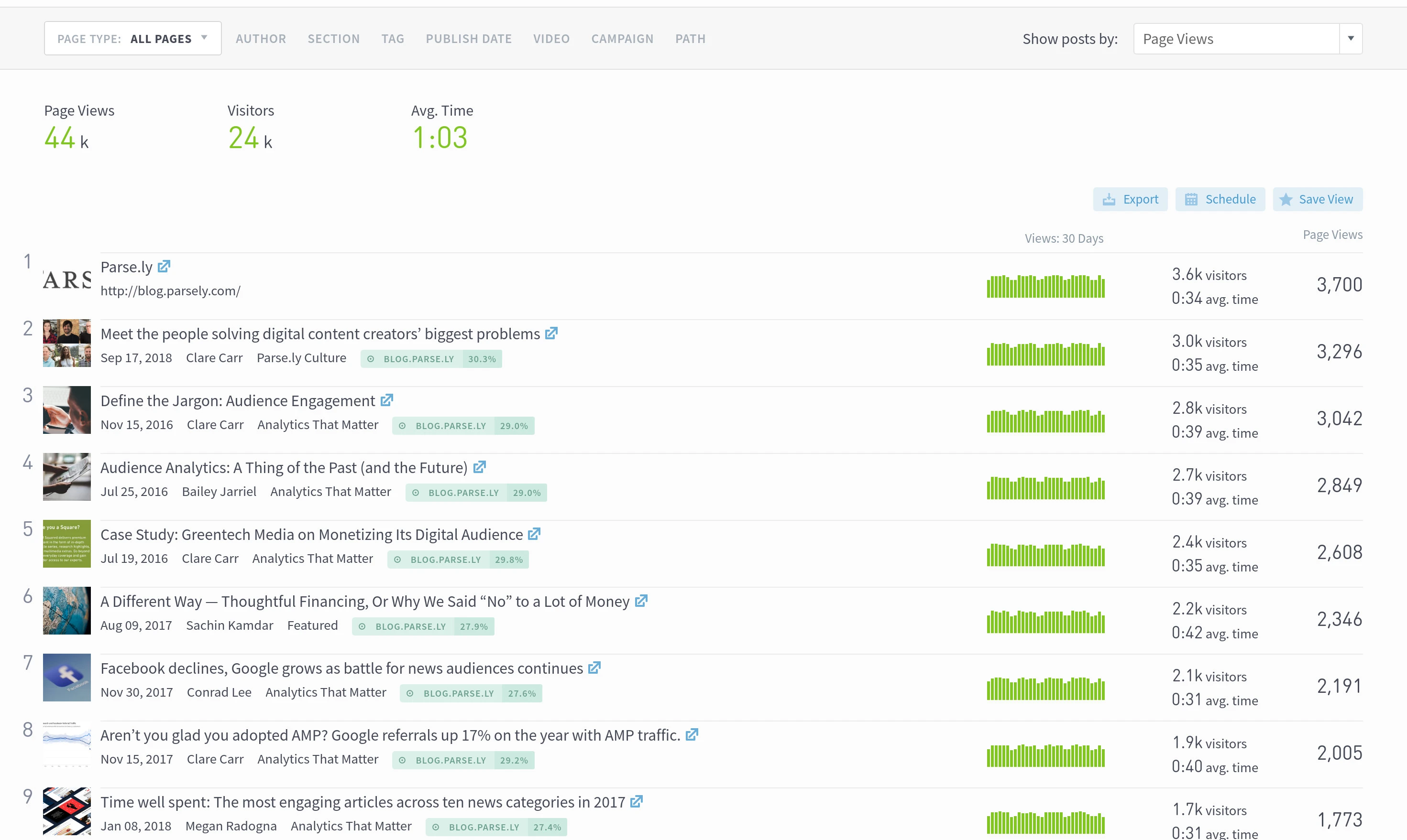
Parse.ly Analytics is an analytics software for online publishers. They can be traditional publishers, like online news sites, or they can be company blogs or any other type of site with authored content.

Customers drop a piece of code on their website that sends anonymous pings to Parse.ly servers. Those are then bunched up together and Parse.ly, and the frontend team by proxy, does its best to make sense out of it.

The main users of Parse.ly Analytics are journalists, editors, analysts, and people from marketing. They come to check how their posts are doing - how many people are reading them, do they stick around, and so on. And, because the interface is fairly straight-forward, they can find what they need and promptly return to their main task, whatever that may be.

Tangible Concepts

Navigation and 'pulse' timeline

The first thing that sets Parse.ly apart from other site tracking software, is usage of tangible concepts. An article (or a "post") has a few very easy to understand attributes - somebody, an author wrote it, it was filed in a section (e.g. news, or sports), it might have had some tags on it, and so on. Dashboard's top navigation reflects that. And when people try to make sense out of their data, they know exactly where to click.

While not particularly revolutionary, the reason why we could do that in the dashboard was because we knew exactly what we wanted to track. This simplified things greatly and, I'd venture to say, is the central reason why people find it easy to use.

Data is Interface

The historical timeline (green bars)

The historical timeline (the green bars in the screenshot) actually came from Project Hamster, my hobby project that I'd been working on way before I joined Parse.ly. For me, interactive data is as close as you can get to the holy grail of user interface design, which is "the best interface is no interface". All you have here is pure information. You can see traffic over time, and based on that you can make quick decisions as to which specific dates you want to zoom into.

The Starting Point

First screen you see on logging in

Having a good starting screen can be tricky at times - what is the most useful information to someone who just logged in? And can we avoid distracting them, so they don't forget what they came for in the first place?

The first thing you see after logging in is the Overview screen. On top left there is a brief summary as to how it is going, the graph on right doubles down on that message and, if the user wants to know more details, the top post listings show the current day and last 10 minutes, allowing to quickly grok which posts exactly have been driving reader attention.

Context

The 3 metrics on the right represent a 'triplet'

When Parse.ly Analytics backend went from tracking just pageviews, to tracking unique visitors, time on page, and a sea of other metrics, the frontend team was suddenly flush with numbers to show. As exciting as it was, we came quickly to realisation that we can't just dump all the data on the user as that would just cause an instant cognitive overload.

The solution we ended up with is a compromise. When you sort by any of the many metrics, the interface adds to the list two relevant context metrics. Say, if you look at total time spent reading an article, it will also tell you how many users there were.

Zoom & Focus

Author benchmarking page

While the main interface is good at reporting day-to-day numbers, every now and then you might want to take a step back and look at how are things going in general. How does your performance as an author compare to that of the others in your company. Or how are we doing on a certain topic. This is where the benchmarking functionality comes in.

One of the personal biggest joys on this one was the 3x3 sparkbar (the tiny bar graphs in the screenshot) grid. As it at a glance allows to quickly see which aspects the author excels at, and in which ones there are things to be learned from other people.

The Frontend Handbook

Finally, the final bit is just more bits. As the team went from one to two, to four people, I got a little worried about the possibility of standards declining over time, as lessons learned would be forgotten—a risk that any company that has been around for a while is well familiar with. That prompted the creation of the handbook: an attempt at an all-encompassing manual for how to be an upstanding citizen in the world of interfaces.

The third section in it covers all things UI. One of the most revealing findings for me over the years has been that, when it comes to complex UI problems, there is no one best solution. Rather it's a decision between focus and flexibility.

I'm sharing it in hopes that the guide might be helpful to others!

Download Handbook (PDF) »
Mastodon